

Colors do more than decorate an advertisement. They trigger emotional responses, signal brand values, and push consumers toward a purchase or away from it. Studies show that consumers form an opinion of a product within 90 seconds, and up to 90 percent of that impression is based on color alone. Understanding the psychology of color in advertising can help brands choose hues that support their message and connect with their target audience. This article breaks down the key principles, gender differences, cultural variations, and real-world examples that matter most to advertisers.
What Is Color Psychology in Advertising?
Color psychology is the study of colors in relation to human behavior. In advertising, it refers to how specific hues and shades influence the way people perceive a brand, feel about a product, and decide whether to buy. Research indicates that color influences brand recognition by up to 80 percent, making it one of the most powerful visual tools in a marketer’s toolkit. While color psychology is not an exact science and is sometimes debated, the general guidelines are widely used by agencies and designers to craft effective campaigns.
The Role of Color in Consumer Decision Making
Color affects buying decisions at a subconscious level. According to one study, 93 percent of buying decisions are based on visual appearance, with color being a major factor. That means the colors on a website, product package, or social media ad can determine whether a visitor clicks “buy” or leaves the page. Because the initial impression happens in seconds, choosing the right color combination is critical for driving engagement and sales.
Warm Colors vs Cool Colors
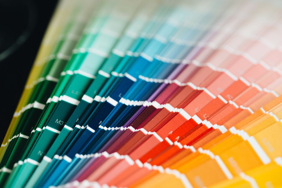
Colors are often grouped into warm and cool categories, each carrying distinct psychological associations. Warm colors include reds, oranges, and yellows. They tend to create energy, excitement, and emotional intensity. Cool colors include blues, greens, pinks, and purples. They are associated with calmness and soothing effects. Advertisers select warm colors when they want to provoke urgency or passion and cool colors when they want to build trust or relaxation. The choice depends on the product type and the desired emotional response.
Red: Passion, Urgency, and Danger
Red is associated with passion, power, confidence, and strength. It attracts attention quickly and represents both warmth and danger. This duality makes red effective for clearance sales, fast food logos, and energy drinks. Notable brands using red include McDonald’s, Redbull, and Coca-Cola. However, red can also signal fear or danger, so it must be used carefully depending on the context.
Orange: Warmth and Enthusiasm With a Risk
Orange evokes warmth, excitement, and enthusiasm. It is less aggressive than red but still energetic. Brands such as Discover, Harley Davidson, and Amazon use orange to project optimism and friendliness. Yet advertisers need to be aware that 26 percent of respondents associate orange with cheap products, according to one study. This perception can work against premium or luxury brands.
Gender and Color Preferences
Men and women tend to respond differently to colors, and understanding these preferences can help advertisers target their audience more effectively. Blue is the favorite color for 57 percent of men and 35 percent of women. It is the most universally liked color across genders. Men’s second favorite color is red, preferred by 8 percent of men. Women’s second favorite is purple, chosen by 23 percent of women. Green is liked by 14 percent of either gender, making it a relatively neutral choice. The least liked colors overall are orange, disliked by 29 percent of people, and brown, disliked by 23 percent.
Cultural Influences on Color Perception
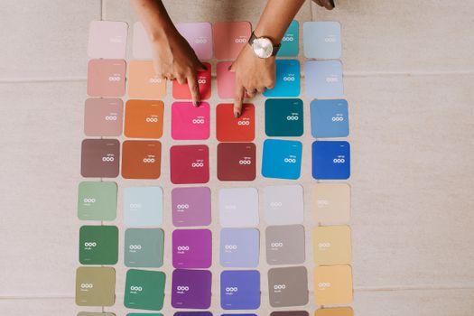
Color meanings are not universal. What works in one country can backfire in another, so advertisers running international campaigns must research local symbolism. White symbolizes purity in Western cultures but is associated with death in Japan. Red signals danger in the West but represents luck and prosperity in China. A famous example involves Pepsi’s light blue brand color, which was associated with death in parts of Southeast Asia, hurting sales in that region. These cultural differences highlight why a one-size-fits-all color strategy rarely succeeds on a global scale.
Real World Examples of Color in Branding
The psychology of color in advertising is visible in the choices made by well known companies. Red is used by McDonald’s, Redbull, and Coca-Cola to create energy, appetite stimulation, and brand recognition. Orange appears in the logos of Discover, Harley Davidson, and Amazon, where it communicates warmth, enthusiasm, and a call to action. These brands have invested heavily in color research and consistently apply their chosen palettes across all advertising channels. Their success demonstrates that a carefully selected color can become a core part of a brand’s identity.

Practical Takeaways for Advertisers
To apply color psychology effectively, start by defining the emotional response you want customers to feel. If you need urgency, energy, or passion, consider warm colors like red or orange. If you want to build trust, calm, or reliability, lean toward cool colors such as blue or green. Consider the gender makeup of your target audience and the cultural contexts in which your ads will appear. Test your chosen colors with real consumers before committing to a full campaign. Color psychology provides valuable guidance, but it works best when combined with audience research and testing.
Frequently Asked Questions
How important is color for brand recognition?
Color influences brand recognition by up to 80 percent, according to research cited by multiple studies. This means the colors a brand selects are one of the most memorable aspects of its visual identity. Consistent use of color across logos, packaging, and advertising strengthens recall and helps consumers identify a brand quickly.
Can the same color mean different things in different cultures?
Yes, cultural associations vary significantly. For example, white symbolizes purity in Western cultures but death in Japan. Red represents danger in the West and luck in China. Advertisers running global campaigns must research local color meanings to avoid unintended negative reactions.
Do men and women prefer different colors?
Research shows differences in color preferences between genders. Blue is the favorite color for 57 percent of men and 35 percent of women. Men’s second favorite is red, while women’s second favorite is purple. Green is equally liked by 14 percent of each gender. Orange and brown are the least preferred colors overall.
Which colors are considered warm and which are cool?
Warm colors include reds, oranges, and yellows. They are associated with energy, excitement, and emotional intensity. Cool colors include blues, greens, pinks, and purples. They are associated with calmness and soothing effects. Advertisers choose between these groups depending on the emotional tone they want to create.
Does color psychology always work the same way for everyone?
No, color psychology is not universally reliable. It offers general guidelines, but individual reactions can vary based on personal experience, culture, and context. The same color may trigger different emotions in different people. Advertisers should use these principles as a starting point and test their choices with real audiences.